The Reader Who Isn't You: An Accessibility Pass for Print and Digital Editions

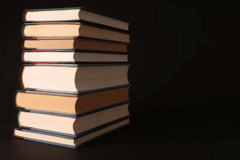
Photo by Photo by NordWood Themes on Unsplash on Unsplash
Most pre-press conversations at Foundry Press start with the same familiar cast: bleeds, font embedding, image resolution, colour bars. Accessibility tends to arrive late, usually as a question from a librarian, a school buyer or a funding partner. That is backwards. If a book is hard to read, no amount of clean preflight will save it.
The good news is that accessibility is mostly a set of production choices. You do not need a separate workflow or a new department. You need to decide, early enough, who the book is for and what the page is doing to help them.
Start with the page, not the PDF
Print still matters. For dyslexic and low-vision readers, the physical page carries a lot of the burden. Body type is the first lever. A 9pt serif may look elegant in a PDF proof, but it is a strain on paper. For general adult trade books, 11pt is a sensible floor; 12pt is friendlier. Large-print editions usually start around 14pt and go up from there.
Leading matters as much as size. A tight 12/13 setting saves pages and money, but it closes the page down. Aim for 1.3 to 1.5 times the type size — so 12/16 or 12/18 — and test it on a paper dummy, not just a screen. Line length should sit somewhere around 60 to 70 characters. Wider measures force the eye to travel further and make the return sweep harder.
Alignment is another quiet decision. Fully justified text creates rivers of white space and uneven word spacing; ragged-right setting is usually kinder. Avoid automatic hyphenation across line breaks where you can, and keep italics for short emphasis rather than long passages. All-caps settings are best kept to display type, not body copy.
Paper, opacity and the glare problem
Show-through is an accessibility issue. A thin, translucent paper lets the reverse of the page ghost into the reading line, which is tiring for everyone and worse for readers with low vision or visual stress. An 80gsm opaque text paper can be fine; 90gsm or above gives more reassurance. Uncoated or lightly coated stock is generally preferable to a glossy sheet that throws light back at the reader.
Cream or off-white paper is often recommended for dyslexic readers, though preferences vary. The practical move is to ask your printer for a paper dummy in two or three options and test them under ordinary room light, not a desk lamp. If you move to a heavier or bulkier sheet, remember that spine width and page count will shift. Recalculate before the cover is final.
Contrast is a production spec
High contrast does not mean harsh black on blinding white. It means enough separation between text and background, without glare. Dark grey or black ink on a cream uncoated sheet is a reliable starting point. Pale grey type, fine reverse-out type and text over busy images are the usual offenders.
For digital editions, contrast is measurable: WCAG asks for at least 4.5:1 for normal text. For print, you are judging ink density and paper colour by eye and by proof. Either way, check the actual cover artwork, not just the interior. A beautiful photograph with a caption in 7pt white type is a production problem waiting for a reader to complain.
Navigation is part of the reading experience
A book that cannot be navigated is not fully accessible. In print, that means clear page numbers, useful running heads, a contents page that actually helps and chapter openings that are easy to find. Avoid decorative page numbers that disappear into the margin. If the book has sections, signpost them.
In digital editions, navigation becomes metadata and structure: a logical reading order, bookmarks, proper heading levels, alt text for images and a meaningful title page. If you are producing an EPUB, aim for WCAG 2.2 AA and check it against EPUB Accessibility 1.1. If you are only producing print, you still have ONIX. Add an accessibility summary and accessibility features to your metadata. It costs nothing and it helps librarians, retailers and aggregators know what they are buying.
What it costs, and what it saves
Accessibility choices do have a unit cost. Larger type means more pages. More pages mean more paper, a thicker spine and a higher print bill. Heavier opaque paper costs more than a lightweight sheet. Uncoated stock can carry a premium. A large-print edition may need its own ISBN, cover and proof cycle.
But the savings are real too. Fewer returns from schools and libraries. Fewer complaints. Access to public-sector and education markets that ask harder questions than they used to. A standard edition and an accessible edition can sit alongside each other rather than replacing one another. And the cheapest accessibility fix is still the one made before the PDF is final.
Questions for the printer before the PDF is locked
- Can you supply paper dummies in 80gsm and 90gsm opaque, uncoated if possible?
- What body type size and leading would you recommend for this trim and page count?
- Will a heavier paper change the spine width enough to affect the cover?
- Can you check gutters and creep if we move to 14pt body text?
- Do you offer a cream or off-white text stock, and what does it add per copy?
- Can you quote a large-print edition at 16pt with a wider trim?
- Do you produce accessible PDFs, or can you recommend a conversion route?
- Can you hold a printed copy for a reader test before the full run?
A short preflight checklist
- Body type at 11pt or above, with 1.3–1.5 leading.
- Ragged-right setting, no tight justification, minimal hyphenation.
- Uncoated or low-glare paper with good opacity.
- Strong ink-to-paper contrast; no pale grey body text.
- Clear page numbers, running heads and contents.
- Digital files with reading order, headings, alt text and bookmarks.
- ONIX accessibility metadata completed, even for print-only titles.
- One real reader test before the run, not just an in-house proof.
Accessibility is not a separate edition of publishing. It is the same job, done with a clearer picture of who is holding the book. Put it on the pre-press checklist and it stops being an afterthought.