Past the Flyleaf: Giving Endpapers a Proper Spec Before the Cover Takes Over
Photo: close-up printed endpapers inside a hardback book, bookbinding detail, via dcx0p3on5z8dw.cloudfront.net
Endpapers have an odd place in small-press publishing. They are structural, visible, and almost always sorted out at the last minute, somewhere between approving the cover proof and confirming the delivery address. That is a shame, because the endpaper is one of the few places where a publisher can add genuine perceived value without reopening the cover design, changing the trim size, or renegotiating the whole print job.
Think of it as the handshake before the conversation. A reader opens the book, sees the sheet, feels the hinge, and forms an opinion before they have read a word. A plain white endpaper is not a crime, but it is also not doing much work. A considered one can make a 500-copy run feel more deliberate than it has any right to.
What you are actually specifying
Most hardback endpapers are a four-page section: front pastedown, front free endpaper, back free endpaper, back pastedown. The pastedowns are glued to the inside of the boards; the free sheets turn as the book opens. The fold between them is the hinge, and it is the part that takes the strain every time someone opens the book on the train, in the bath, or over a plate of biscuits.
That means endpaper is not just a decorative sheet. It is a moving part. Specify it like one.
Plain versus printed
A stock coloured uncoated sheet is the low-risk option. Paper merchants carry ranges in everything from chalky off-white to deep ochre, and a UK printer will usually have a house endpaper or two already in the workshop. The cost is modest, the lead time is short, and you are unlikely to create a production problem. If your cover is already doing a lot of shouting, a quiet coloured endpaper can be the more confident choice.
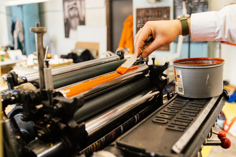
Printed endpapers are where the fun starts. A repeat pattern, a map, a solid brand colour, a photograph, a bit of type: all are possible. But printed endpapers are a separate printing pass, often on a different stock from the text, and often in smaller quantities than the rest of the book. That changes the economics. You are paying for plates, make-ready, running waste, and sometimes hand-feeding. For a short run, the set-up can be a significant share of the bill.
The trick is not to ask ‘can we print the endpapers?’ but ‘what is the endpaper doing that the cover cannot?’ If the answer is ‘it looks nice’, a coloured sheet may be enough. If the answer is ‘it sets up the world of the book before chapter one’, a printed sheet can earn its keep.
Paper weight, grain and the hinge
Endpaper stock usually sits somewhere between 100gsm and 160gsm. Go too light and the free sheet can tear at the hinge after a few months of enthusiastic reading. Go too heavy and the book can feel stiff, especially if the text block is thick and the cover boards are already on the firm side.
Grain direction matters more than most people expect. The grain should run parallel to the spine so the sheet folds and turns with the hinge rather than fighting it. A 120gsm sheet with the grain running the right way will often behave better than a 150gsm sheet with the grain across it. Ask your printer to confirm grain direction on the actual stock, not just the description in the sample book.
Also ask about the hinge allowance. A small gap between the pastedown and the text block spine — often around 5mm to 8mm, depending on the binding — gives the cover room to open. Glue that runs too far into the hinge is a common cause of cracking, stiffness, and the dreaded ‘crunch’ when a reader opens the book for the first time.
Glue, humidity and the British climate
Endpapers are glued at the pastedown, and glue behaviour is one of those things that is easy to ignore until a batch of books arrives in a damp week and the covers start to curl. PVA and EVA behave differently, and the amount of glue matters as much as the type. Too little and the pastedown lifts; too much and the moisture can ripple the sheet.
If you are printing on coated stock, check that the glue will key to it. Uncoated endpapers are generally more forgiving. If your printer is binding in-house, ask them to pull a sample from the run and open and close it a few dozen times. It sounds crude, but it catches more than a spec sheet will.
Colour matching is not a proof on a screen
If you are printing a solid colour or matching a brand palette, do not approve it on a desktop laser proof. Ask for a drawdown or a proof on the actual endpaper stock. Uncoated sheets drink ink differently from coated ones, and a Pantone that looks punchy on a swatch can go muddy on a warm cream paper.
Coloured stock also varies between batches. If you are using a stock coloured sheet and matching it to the cover, ask for a sample from the actual lot. And keep large solid areas away from the hinge fold if you can; ink sitting on a fold is more likely to crack than a pattern or a lighter tint.
The cost question
For a short run, the difference between a standard coloured endpaper and a custom printed one can be a few hundred pounds once plates, make-ready and spoilage are counted. A one-colour pattern is usually the gentlest step up; a two-colour or photographic endpaper can push the figure further. The exact number depends on the printer, the stock, the run length, and whether the endpapers can be printed alongside something else.
Ask for the endpaper line as a separate number on the quote. That way you can see what the storytelling is actually costing, and decide whether the money is better spent there or on, say, a better text paper or a slightly longer print run.
A short checklist before you sign off
Confirm the endpaper is a four-page section, not a single sheet. Check the grain direction runs parallel to the spine. Ask for the hinge allowance in millimetres. Get a proof on the actual stock. Confirm the glue type and who is applying it. And ask your printer to open and close a sample before the full run is bound.
None of this is glamorous. But the endpaper is the cheapest page you will ever design — and the one most likely to be forgotten until the cover is already on press.