The Two-Millimetre Problem: Getting Spine Width Right When Paper Won't Sit Still

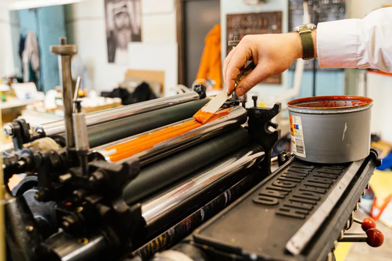
Photo: Godot13, CC BY-SA 3.0, via Wikimedia Commons
There is a particular kind of silence that fills a small press office when the first advance copy comes out of the jiffy bag and the spine text is not centred. Not wildly off. Just enough. A millimetre and a half at the head, maybe two at the tail, and a author name that now looks like it was placed by someone guessing. The artwork said 18.4mm. The book says something else. Nobody is lying, exactly. The spine has simply done what spines do: it has moved.
The spine is a calculation, not a measurement
When you approve a cover PDF, you are approving a prediction. For perfect-bound books, the printer calculates spine width from the page count, the paper stock's bulk, and the cover board or card thickness. For case-bound books, you add the boards themselves, the turn-ins, the hollow back, and the small amount of give that a cloth or paper wrap introduces. The arithmetic is not mysterious, but it is not universal either. A 80gsm cream novel paper from one mill can bulk differently from a 80gsm cream from another. Coated stock behaves differently again. Recycled uncoated papers, bless them, can vary batch to batch in ways that make a mockery of a single number typed into InDesign six weeks before print.
This is why a printer's spine calculation is only as good as the information you give them. Page count at final, stock specified by name and weight, cover material confirmed, and binding method locked. If any of those shift after you approve artwork, the spine width shifts with them.
Bulk, caliper and the great paper swindle
Paper is sold by weight, but books are made by thickness. A 90gsm paper sounds sensible until you realise that bulk — the thickness of a given number of sheets under a specified pressure — is what actually fills the spine. Two papers of the same gsm can differ by several percentage points in bulk. Multiply that across 320 pages and you have a spine that is visibly wider or narrower than the one in your artwork.
UK printers will usually quote a spine width based on the mill's nominal bulk figure. That is fine as a starting point. It is not fine as a guarantee. Ask what bulk figure they have used, and whether they have recent experience of that exact stock. If they are printing on a paper they buy regularly, they will know its habits. If it is a special order, treat the number with polite suspicion.
Case-bound books: the board is part of the spine
For hardbacks, the spine width is not just the text block. You have two boards, each typically 2mm to 3mm thick, plus the wrap material, plus the small gap or joint that lets the cover open. A case-bound spine calculation might include 1.5mm of board on each side before you even get to the paper. Change from a 2.5mm board to a 3mm board and your spine grows by a millimetre without a single extra page.
The wrap allowance matters too. Cloth and paper covers are turned in at the edges, and the spine can gain or lose a fraction depending on how tightly the case is made. A printer who case-binds regularly will have a house style for this. Ask them to write it down.
What tolerance actually means in the real world
Printers do not promise an exact spine width. They promise a range. For perfect binding, a tolerance of plus or minus 1mm is common on a spine of around 20mm; for case binding, it can be wider. That sounds generous until you put 6mm of spine text on a 12mm spine and realise that a 1.5mm drift is the difference between comfortable and cramped.
The practical rule for small presses is simple: design for the middle of the tolerance, not the edge. If your printer says 18mm plus or minus 1mm, artwork your spine text to sit comfortably within 17mm to 19mm. Leave at least 3mm of clear space at the head and tail of the spine before any text starts. On narrow spines, run the text horizontally rather than vertically, or drop it entirely and use the cover to do the work. A spine without text is not a failure. A spine with text that wraps around the edge is.
Get the calculation in writing — and test it
Ask your printer for a spine calculation sheet before you finalise artwork. It should list: final page count, paper stock and bulk, cover material, binding method, board thickness if case-bound, and the calculated spine width with its tolerance. Keep that email. If the page count changes at proof stage, ask for a revised calculation. Do not assume the old number still applies.
Then make a dummy. Not a digital one. A physical one. Ask the printer for a blank or a printed dummy at the correct page count and stock, or make one yourself from the actual paper if you can get hold of it. Wrap it in cover card of the right thickness. Measure the spine with callipers, not a ruler. Compare it to your artwork. If the dummy is 19.2mm and your artwork says 18.4mm, you have found the problem before the print run, not after.
Build artwork that bends without breaking
A spine that survives production variation is one that has been designed with slack. Keep essential text — title, author, publisher logo — within a central safe zone. Avoid placing rules, borders or background panels that rely on hitting the spine edge exactly. If you are using a coloured spine panel, extend it slightly onto the cover so a millimetre of drift does not leave a white sliver at the joint. And always check the spine in a printed proof, not just on screen. A PDF at 400% zoom will not tell you how it feels in the hand.
The spine is one of the few parts of a book that has to be both structural and graphic. Treat it like a production component, not a decoration. Get the calculation in writing, test it with a dummy, and design for the range rather than the number. Your future self — the one opening the first advance copy — will thank you.